Showing posts with label Kamarul Shah. Show all posts

Wednesday, 13 July 2016

MANAGING DESIGN


RESEARCH OF TATTOO

Tattoo is a form of modification, made by inserting ink, either indelible or temporary, into the dermis layer of the skin change the pigment. The word tattoo or tattow in 18th century, is a loan word from the Polynesian word tatau meaning "correct, workman like".

The first written reference to the word tattoo(or tatau) appears in the journal of Joseph Bank( 24 February 1743- 19 June 1820), the naturalist aboard Captain Cook's ship the HMS Endeavour. Tattoo enthusiasts may refer to tattoos as "ink", "pieces", "skin art", "tattoo art".


TYPES OF TATTOO

The American Academy of Dermatology distinguished 5 types of tattoo:

1. Traumatic Tattoo(Natural Tattoo)
2. Amateur & Professional Tattoo
3. Identification Tattoo
4. Comestic Tattoo
5. Medical Tattoo

1. Traumatic Tattoo(Natural Tattoo)

According to George Cowell, coal miners could develop characteristics tattoo owing to coal dust getting into wounds. Similarly, a traumatic tattoo occurs when a substance such as asphalt is rubbed into a wound as the result of some kind of accident or trauma. An amalgam tattoo is when amalgam particles are implanted in the soft tissues of the mouth, usually gums, during dental filling placement or removal. Another example of such accidental stabbing with pencil or pen.


Image 1: Traumatic Tattoo taken from http://www.avalonmedispa.co.uk/wp-content/uploads/2015/11/TraumaticTattoo.png


2. Amateur and Professional Tattoo

Many tattoos serves as rites of passage, mark of status and rank, symbols of religious and spiritual devotion, decorations for bravery, sexual lures and marks of fertility, pledges of love and etc. The symbolism and impact of tattoos varies in different places and cultures. Today people choose to be tattooed for artistic, cosmetic, sentimental, religious and etc.


Image 2: Professional and Amateur Tattoo taken from http://www.kissyourinkgoodbye.com/uploads/5/0/1/9/50198399/4868652.jpg?299


3. Identification

People forcibly been tattooed. A well known example is the Nazi practise of forcibly tattooing Nazi concentration camp inmates with numbers during Holocaust as part of Nazi's Identification system in order to identify the bodies registered prisoners in the concentration camp. Tattoo also has been used for identification in other ways for example in early Zhou, Chinese authorities would employs facial tattoo as a punishments for certain crimes or to mark prisoner or slaves. In period of early contact between Maori and Europeans, the Maori people hunted and decapitated each others for their moko tattoos, which they traded for Europeans items.
Tattoo are sometimes used by forensic pathologists to help them identify burned, petrified or mutilated bodies as tattoo pigment lies encapsulated deep in skin, tattoo are not easy to destroy even when the skin is burned.


Image 3: Identification Tattoo of inmate of concentration camp taken from http://inkalab.in/wp-content/uploads/2013/06/identification.jpg


4. Cosmetic Tattoo(Permanent makeup)

The cosmetic surgery industry continues to see a trend of increased popularity for both surgical and non invasive procedures. When used as a form of cosmetics, tattooing includes permanent makeup and hiding or neutralising skin discolorations. Permanent makeup is use on tattoo is to enhanced eyebrows, lip liner, eyeliner and mole. The colour they usually use is natural colour as it to resemble makeup.


Image 4: Cosmetic Tattoo taken from http://sydneycosmetictattoo.com/wp-content/uploads/2014/08/Cosmetic-tattoo-web1.jpg


5. Medical Tattoo

Medical tattoo is used to re information the wearer about they blood type, medical condition and etc. Some use tattoo as treatment for vitiligo, skin pigmentation disorder. Tattoo also use in Alzheimer's patient where they put they name so that they can be identified if they are missing.


Image 5: Example of medical tattoo taken from http://www.rcinet.ca/english/illustration/chronicle/HsMHPl_ScreenShot122.jpg


TATTOO RISKS

Because tattoo is required by breaking skin it can leads into allergic reaction and infection. Modern tattoos is low the risks of the infection by following universal precautions by using one single items and sterilising their equipment after each use. In amateur tattooing such as practising in the prison, there is an elevated risks for infections that been transmitted by the use of unsterilised tattoo equipment. for example fungal infection, hiv, herpes simplex virus and etc.


Image 6: Example of risks of tattoo taken at http://img.webmd.com/dtmcms/live/webmd/consumer_assets/site_images/articles/health_tools/tattoos_slideshow/phototake_rm_photo_of_MRSA_infected_tattoo.jpg


REMOVAL OF TATTOO

While tattoo is considered as permanent, they also can be removed fully or partially by laser treatments. Typically, black and some coloured inks can be removed more completely than inks of other colours. The expense and pain associated with removing tattoos are typically greater than the expense and pain associated with applying them. 


Image 7: Laser tattoo removal taken from https://upload.wikimedia.org/wikipedia/commons/0/0d/Laser_Tattoo_Removal_Alice_Pien_MD_AMAskincare.jpg


Tuesday, 24 May 2016

GROUP DESIGN PROJECT


EXHIBITION DAY

The exhibition day is 20th May 2016 at Vertical Studio B, the date should be on 18th May 2016 and the venue is at AAVA Gallery near the Library but because of some technical problem and this is change into Studio B.

In here, the set up is not look as we plan because of the last minute change but we try to create the place as we decided to do as what plan first. We plan our exhibition with minimum cost and ready to present our artwork.

Using the black flexible PVC fence to hang our artwork, all five of us is there but Samira is not because on the day we decide to buy the material, we ask her and said she doesn't want to that why she didn't hang it together on the fence.

We hang the plastic fence on the the ceiling using fishing line and stapler gun it on the wood platform to stabilize it. Then we glue the flexible wire on our artwork using hot glue gun then we bend the wire so that we hang the ortwork on the fence.

Here is the picture on the set up day.


Picture on the Exhibition Day


GROUP DESIGN PROJECTS


COMMITTEE MEMBERS

FIRST COMMITTEE MEMBERS

Leader: Satish
Vice Leader and Treasury: Siti Aisyah
Public Relations: Jeffry
Logistic: Hatmi
Exhibitions: Alexis
Creative Director: Samira

Then it changes because of some problem,

SECOND COMMITTEE MEMBER

Leader: Alexis Lyndy
Creative Team: Leader: Samira Jamali
                                     : Jeffry Jilan
                                     : Siti Aisyah
Exhibition and Set up: Alexis
                                   : Mohd. Hatmi
                                   : Satish
Proposal: Satish

Committee ( commission) is a body of one or more person that is subordinate to a deliberative assembly. When doing the project, we also has meeting and this will be handle by Aisyah as a secretary. From this we learn how to organize our work and what role we do to. First my role is as a exhibition member, my role is to find place for set up and where we going to do for the exhibition.


Image 1: The AAVA Gallery that we choose as the first choice to exhibit.


Image 2: Tomie as my co-partner is measuring the gallery.


Image 3: Balai Seni Lukis as my reference for the exhibition set up.


As my role change into leader, I need to lead my group and have meeting with them and also asking about their opinion how they want they space is, what material we should use in the exhibition. There are so many thing that I need to handle but with the help of my group and also the role that we hold it made it move systematically.


Friday, 20 May 2016

DESIGN SYSTEM AND SERVICES


 WIRE FRAME AND INTER FACE OF IBANJI

Wire frame is created to understand how a system and services work from first step until final step. Here is my wire frame for my IBANJI and show the chart of how this system from A to Z.


Image 1: IBANJI Wire frame

Interfaces is how the system work from one step into another step. So this is how the IBANJI system work. First the user can downloaded the applications from playstore for android or Apple appstore for iPhone. Then after download and installing, the user can just forward into the setting and click on (Language and Input) and go to keyboard setting and choose on IBANJI keyboard. After that, user go into messaging and start using the IBANJI to typing message.


Image 2: IBANJI Interface


DESIGN SYSTEM AND SERVICES


 PROGRESS

 After understanding about the system of emoticon, then I proceed to doing the design of the emoticon of Ibanji. I look up into chinese character as references to design this emoji.

My References:


References 1: Chinese Alphabet: Images taken at https://www.dramafever.com/st/news/images/Screen_Shot_2014-02-12_at_3.16.41_PM.png


References 2: Chinese Alphabet: Images taken at http://ecx.images-amazon.com/images/I/71RG8BOH27L.jpg

From this using the Iban language I develop the emoji characters using this refences. To create the emoji characters, it kind of difficults, because I need to simplified the shape and design a characters so the users understand what the characters displays for.

Progress for creating characters:


Progress 1: Development of IBANJI characters: Images taken from Alexis's camera phone.


Progress 2: Development of IBANJI characters: Images taken from Alexis's camera phone.

Then I proceed toward to design it digital, after done of develop the characters.


Progress 3: Final Outcomes of the Ibanji characters.

When doing this, I learn how to interpret symbol or sign into a language and how difficult it is if the symbol is hard to understand and the meaning that are shown are not clear or confusing and my focus also is to help elder to communicate with youngster in world of technology.


Thursday, 7 April 2016

GROUP DESIGN PROJECT


EXHIBITION

An exhibition in the most general sense, is an organized presentation and display of a selection of items. In practise, exhibitions usually occur within museum, galleries, and exhibition halls and world's fair. Exhibitions can include many things such as art both in major museums and smaller galleries, interpretive exhibitions, natural history museums and history museums and also varieties such as more commercially focused exhibitions and trade fairs.

The word exhibitions is usually, but not always, the word used for collections of items. Exhibitions may be permanent exhibition or temporary but in a common usage 'exhibitions' are considered temporary-usually focus scheduled to open and close on specific dates. Some exhibitions are shown in multiple location are called 'travelling exhibitions'.


MUSEUM

A museum is an institution that cares for (conserve) a collections of artifacts and other objects of artistic, cultural, historical or scientific importance and makes them for public viewing through exhibit that may be permanent or temporary. Some of most attended museums include the Lourve in Paris, the National Museum of China in Beijing, the British Museum in London.


DESIGN SYSTEM AND SERVICES


TASK 1

DESIGN SYSTEM AND SERVICES

From this task we need to find the weakness or gap in system that we choose, so that we can amends or create new system from this weakness.

I choose emoticons or emoji. Why? Even though emoticons is a common system that everyone has already use to show their inner emotions and to communicate with people without talking to each other but there are still weakness in the systems where emoticon can be difficult to to interprets and they sometimes could be misunderstanding between users. My focus is in Sarawak.


Emoticons make us better communications. Human are nothing if not social. So much so that we experience significant physical and psychological problems without social interactions. Krystal D'costa of Scientific American says: " As social beings we require consistent and frequent of confirmation of our social placement. This confirmation is vital to the preservations of our network-we need to able gauge the state of our relationship with other."

Another research is made by researchers at Tokyo Denki University, Japan founds that the more graphic the emoticon, the more our brain responds to it. As the emoticon becomes less abstract(or more human like) the brain responds accordingly.

Picture 1: Effect of using graphic emoticons in human brains by researchers at Tokyo Denki University. Taken at: https://dq9ucdqjq6nrk.cloudfront.net/wp-content/uploads/2014/02/Yausa.jpg.

More graphics is the emoticon cause our brain to activate the temporal gyrus which is responsible for recalling biological motions. Humans understands emoticons to be emotional communications, which results of the activation of the right frontal gyrus as seen above.

There another weakness also in this system where elder couldn't communicate with the youngster because in Sarawak most elder couldn't read and with the advance technology that happen in our world they will be left out without modernization. Using emoticon would help them to communicate with the younger generation using symbol because it using images.

My ideas is to create a new emoji using Iban language and Iban motif because it is my language and I want to create something that help my ethnics to communicate with each other more and others races also can learn different language using this emoji.


 Picture 2: Iban motif of frog


Thursday, 16 October 2014

CRITICAL THINKING


Subj: Critical Thinking
Task 4: Packaging

In this task we are required to research about packaging and make report about it in power point. This the link of the power point. After making the research then we are required to find package and find out what is wrong in the packaging and make new packaging after choosing the package that we want to redesign.

 Critical Thinking: Packaging pp.

TITLE: PACKAGING DESIGN PROPOSAL

OBJECTIVE OF PROPOSAL: We are decided to make new packaging of the package of the soap package that you have now. We try to redesign the package to be reusable and more towards green.

USE OF THE DESIGN PROPOSAL/AIM: The design is to boost people towards green and reusable. The design also helping people to think about the paper wasting they done before by throwing away the package after taking the content. So I hope this design will change the way people thinking about eco product.

PROBLEM STATEMENT:

1. Using the glue to sticks the packaging together.

2. The wastage of paper that we use to made the packaging.

THE HIGHLIGHT:

1. We want to change the usage of glue in sticking the paper together by making slot to connected the package.

2. We want to make the package by using recycle paper to lower the cost and the wastage of paper been made.

RATIONALE: This product is too made people aware of the wastage of the paper that use by making the packaging. This product also recycle and can reuse to put other thing and this will help people think eco and helping to reduce the deforestation.


Wednesday, 15 October 2014

DIGITAL DESIGN

DIGITAL DESIGN PROPOSAL
TITLE: INSTALLATION ART OF DEFORESTATION PROPOSAL

OBJECTIVE:
      i.        We show the texture of the infertility soil after the deforestation on projector.
    ii.        We will use papers, newspaper or material that be made using tree to show the wastage of paper that human use and this lead to the active deforestation.
   iii.        Using made tree bark to show the deforestation that still happen nowadays and still happen in future if there no prevention and the imbalance of the world.

AIM: This project is to create awareness and let people think about the impact of deforestation    toward the world and preserving it for the next generation.

CONCEPT: Our concept is to show the impact/effect of the deforestation that happen now and toward the future and also happen if this kind of thing cannot be stopped. Our concept also is to let think or reflect about they done for the skyscraper building and ignoring the land they stand now.

MATERIALS: Newspapers, 2 rolls of fishing rope, recycle/unused papers, a bunch of chopsticks, a bunch of toothpicks, 1 bottle of white paint, 2 bottles of glue and wood filler, tree branch, tree age ring texture and tree bark texture.

THE DISADVANTAGES OF DEFORESTATION:
      i.       1. One of the disadvantages of the deforestation is global warming phenomena that lead towards of the increase in sea level and climate change this is because of the increasing temperature from the co2 emission.

      i.         2.  Deforestation also lead to the decrease of oxygen level and the increasing of carbon dioxide because the there are no tree to filter the carbon dioxide and changing it into oxygen.

      i.      3.  Deforestation also lead to the destruction of the wildlife habitat and this will lead to the extinctions, this will causing havoc in the biological food chain and the imbalance of the ecosystem.

      i.             4.  Deforestation also the cause of the soil erosion, without the tree, the soil will lose the fertility because the lack of nutrient and this cause of the desertification.

      i.        5. Deforestation also causing the flood or landslides, because on the heavy rain there no barrier between the rain and the soil because tree is the barrier between rain and land and slowing the rain flow.
      i.       6. Deforestation also the major cause of the greenhouse effect. It’s happen because of the emission of the co2 and it trapped the radiation from the sun and increasing the temperature and depletion of the ozone layer.

RATIONAL: We use the white paint for the tree bark because it is the base paint for the concrete building and this show that the modern things nowadays come from a single tree. We also put the tree stump on the wall to show the people now look up for the modernist for example skyscrapers and forgetting the land they stand on and everything that come from the land. 

Tuesday, 2 September 2014

CRITICAL THINKING


In this task we are required to find word that demonstrate our profile/characteristic through various mean typographic element and expressions.

First, we find word from our friend about our characteristic in 10 words before choosing 5 words that really resemble you.

The 10 words and it meanings.

1. Observant- Quick to notice thing or alert in surrounding.
2. Firm- Resolute and determined or a solid and hard surface.
3. Simple- Easily to understand or done.
4. Patient- Able to accepts or tolerate delays.
5. Exuberant- Filled with or characterized by lively energy and excitement.
6. Friendly- Kind and pleasant, warm, affectionate, and relaxed.
7. Effable- Able to described in words or to be sure.
8. Honest- Free to deceit and untruthfulness;sincere.
9. Tough- Strong to endure a period of hardship and difficulty.
10. Smart- Having or showing a quick witted intelligence.


Monday, 4 August 2014


Subj: Digital Design
Task: Task 1: Create a Movie Poster

In this task, we need to pick one movie and create a poster, 12x18'' (vertical) complete with tag line, photo of actors and etc. We also can use the interesting plots/iconic character/symbolism/metaphor to identical the movie.

 So I pick 'MALEFICENT' the new movies created by DISNEY, starring Angelina Jolie, Elle Fanning, Sam Riley, Imelda Stauton, Sharlto Copley, Juno Temple and Lesley Manville.

This story is based from SLEEPING BEAUTY by portraying the antagonist character Maleficent. Maleficent is a strong and powerful fairy that leave in magical forest names Moors near the human kingdom. When she was a young girl, she fall in love with human, Stefan. After long time didn't see each other, Stefan betray her love to fulfill his ambitions to be king by cutting Maleficent wings after drugged her. Devastated, she crowned herself to be Queen of Moors with her companion Diaval, a black crow that can change to whatever shape she want.

Then Diaval inform her that King Stefan is hosting a party to christening her daughter, Princess Aurora and Maleficent crash into the party by cursing her that on her 17th birthday, she will prick her finger with spinning wheel and fall death like sleep but she offer a caveat after the king beg her, that the curse can be broken by true love kiss. The king afraid with Maleficent vengeance sent Aurora to live with three fairy.

Then, Maleficent taking care of the princess because of the negligence fairy, and Aurora call her Fairy Godmother.


Picture 1: The Original Poster

Then, I create new poster that minimal the plot using a symbol of spinning needle and a hand on the upper side with blood.

Picture 2: The poster that I created

The head of spinning needle resemble the whole of spinning wheel and the hand resemble the princess of that been curse and the blood resembles the she prick her hand on the spinning wheel. 


CRITICAL THINKING


Subj: Critical Thinking
Task: Task 1: Think Hard

In this task we are inform to learn about anatomy of alphabet and create by using A2 size of paper or card without any mark making (pen, pencil, paints and etc). We only allowed to die-cut, cut or fold to create full set of alphabets. Experiment using light, shadow or other color paper/card.

For this task I been experimenting using materials and shape that would help me to create the final projects about this task. For this task, I also need to find a word that resemble me and create the word in A2 size paper. After choosing word ADAPT, I try to create many example of alphabet in different shape and using different materials.

ADAPT : To adjust to new condition or change to become comfortable or try to fit in with the new environment.

ADAPT : Resembles me much, where I come from different environment and easily fit in or be comfortable with new environment.

First I try to using cut and fold but it turn out to be messy and unorganized. I try it in color paper. Then I try by using a symbol type of alphabet by using a rectangle shape but it look strange.


Picture 1: Cut and Fold

Picture 2 : Using a different shape


 Second I try to cut it using triangle shape but didn't die cut it and fold to make it like 3D but I think it wasting a time. I make the small triangle in a many shape ruler and a cutter using different materials this time that is plastic cover.


Picture 3: Using triangle shape and different material

Lastly, I create a word using triangle shape. People usually using triangle to create a symbol but never a words or sentences. So I try using the triangle to creating the word using cut technique after seeing a UP symbol in the boxes. it turn out to be this.

Picture 4: Using a Triangle to creating a word.

But I face a problem in spacing and  the adjustment between the words and the paper size. Then, tutor help to create the ADAPT word using the correct spacing and the adjustment. Then after it finish, I decorate it with water color using spatter technique with different colors in each alphabets and stroke the color at the edge of the alphabets.


Picture 5: The Final Project and Idea Development That I choose.

OVERVIEW

Why I create this word using triangle shape? I always see people using triangle in symbolizing the direction like UP, DOWN, LEFT, RIGHT and etc but people never use triangle to create a word. So I use this shape to create the word ADAPT, to try to adapting it in my chosen word. That why this shape and symbol is my references in solving this task. 


Tuesday, 15 July 2014

CRITICAL THINKING


Subj: Critical Thinking
Task 1: Anatomy of Typography


Yesterday we are learning about ANATOMY OF TYPOGRAPHY in group work by brain storming. This is what we get.

Anatomy of Typography is a study of structure of typeface or describing graphic elements that make up printed letters in typeface. Origin of typography is from Greek root from the words TYPOS= Impressions and GRAPHIA= Writing Anatomy of Typography is also about the learning about the structure of typeface such as ear, hand, arm and shoulder. Each part of this structure in typo is important in each letters just like the human body structure.

There are many types of anatomy of typography.
i. Counter
ii. Diacritics
iii. Glyph
iv. Initial
v. Kerning
vi. Letter-Spacing
vii. Ligature
viii. Subscript and Superscript
x. Swash
xi. Text Figures
xii. Titles

The elements in anatomy :
I. MEASUREMENT :
    i. mean line/x-height
   ii. cap line
  iii. ascent line
  iv. descent line
   v. bare line

II. PART: Consist 9 basis element : Ascender, Descender, Serif, San-Serif, Spur, Stem, Crossbar, Counter and Ligature.

Anatomy of Typography also has character such as Bold, Italic, Underline  and etc.

Typography also contain the readability and legibility. Readability is a primary concern of the typographer and information designer. Legibility is primary the concern of the typeface designer, to ensure that each character or glyph is distinguishable from other characters in font.   

This our brain storming and presentation photo


Thursday, 10 July 2014

CRITICAL THINKING


Subj: Critical Thinking
Lect: Kamarul Shah

Sketching No. 1: BED BUG

NO.1
I choose bed bug because bed bug sometimes look flat (plane view) when we saw it from the above.

Sketching No.2 : BED

NO.2
I choose this because the material look like a large pillow that been put on the middle of bed and it also look someone sleeping in the bed.

Sketching No.3: GRANDFATHER CLOCK

NO.3
This material also remind me about a grandfather clock and the Big Ben at London. That why I choose to draw this.

Sketching No.4: BUTTERFLY

NO.4

This drawing is made from the side view of the material. It give me the idea to draw a butterfly.

Sketching No.5: STAMP PAD

NO.5
The material also giving me idea about stamp pad and because of it flat surface of stamp pad.

Sketching No.6: WATER PISTOL
NO.6
I choose to draw this because it look like water pistol.

Sketching No.7: KEY HOLE

NO.7
This drawing is made from the bottle upper part to look like a key hole in a box.

Sketching No.8: LOLLIPOP

NO.8
This drawing is made the bottom part of the bottle that look like a shape of lollipop.

Sketching No.9: PING PONG PAD

NO.9
This bottom of material also look like ping pong pad.

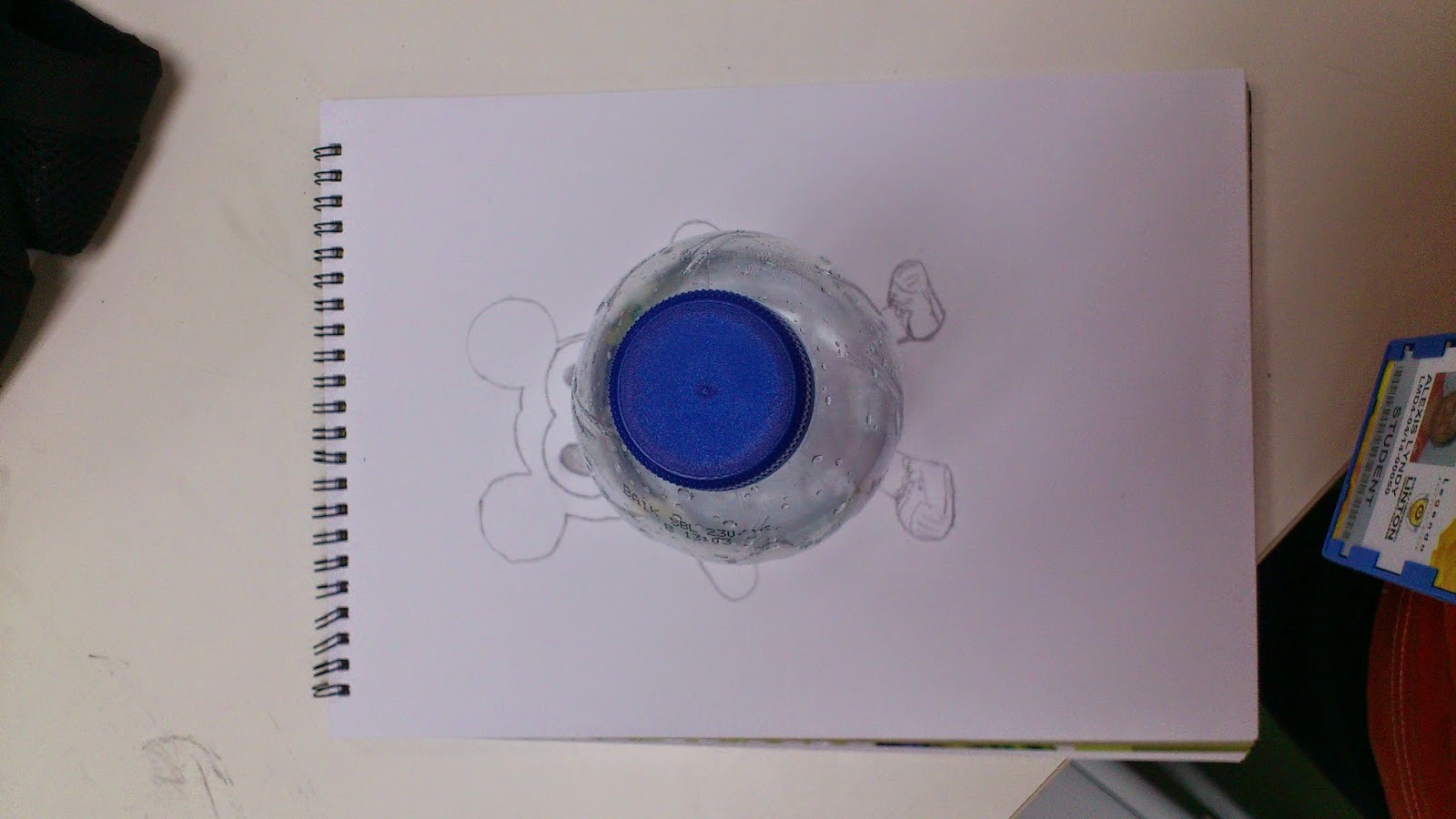
Sketching No.10: DOLL

NO.10
This material also look like a center part of a doll or cartoon and it give me idea to draw this.